A B2C mobile app to help photographers manage clients, photos and business seamlessly.

Photoflow is a mobile app designed to serve as a one-stop shop for photographers, enabling them to manage their clients, photos, and business seamlessly through a B2C application.
User Researcher and Designer
Figma, Figjam, Zoom, Chat GPT, Loom, Google Docs
Discover, Ideation, Design, Testing, Reflection
Photography businesses incorporate many elements, ranging from effective client communication to creating personalized and creative experiences. Due to their multilayered work, photographers often find themselves using various tools which in turn creates challenges in managing end-to-end coordination for photoshoots.
Due to the lack of products that offered an all-in-one solution for photographers to manage their business. Photoflow was designed to complete and streamline all photography business workflows by integrating appointment scheduling, client invoicing, and photo gallery delivery into a single, user-friendly interface. It simplifies the process for photographers, allowing them to manage all aspects of photoshoot coordination and client communication efficiently.


Secondary Research
To better understand the challenges faced by photographers in managing their businesses and delivering quality services to clients, I conducted secondary research. The findings revealed insights into various areas such as time management issues, acquisition and retention challenges, copyright concerns, and marketing hurdles.
Through this research, it became evident that photographers struggle with extensive hours spent on photography sessions, editing, and mastering new tools, highlighting the need for efficient time management strategies. These time management challenges present an opportunity for Photoflow to integrate features that streamline scheduling, task management, and workflow optimization.
The primary objective of this research was to gain insights into the challenges faced by photographers in managing end-to-end coordination for photoshoots. The target audience was individuals who had worked as photographers within the last three years and had experience with end-to-end coordination processes for photoshoots. The survey was distributed electronically through photography forums, social media groups, and direct outreach to photography professionals to reach a wide audience. A total of 13 responses were collected from the survey participants. By understanding their tools, resources, and systems, the research aimed to identify areas for improvement and innovation in the coordination process.
Takeaway 1
The survey revealed that photographers heavily rely on calendar apps and digital communication tools like email and file-sharing services, with all respondents (11 out of 11) using them.
Takeaway 2
The survey highlighted the importance of flexibility in coordinating photoshoots, with the majority of respondents (6 out of 11) emphasizing improvisation for unexpected challenges.
Takeaway 3
The survey revealed that effective client engagement is key, with a majority of respondents (9 out of 11) prioritizing high levels of client interaction.
Jobs to be done (JTBD)
The Jobs to Be Done (JTBD) analysis was conducted to identify the primary tasks and objectives photographers aim to accomplish when using Photoflow. By understanding these key jobs, Photoflow could have features tailored to better meet the needs of photographers in an all-in-one solution.
Some key jobs identified:
When I communicate with clients I want to easily communicate with clients so that I can save time on tasks.
When I am navigating the complexities of coordinating a photoshoot. I want to be able to adapt to situations. So I can change requests as needed for my clients
When I am sharing digital assets with clients I want to be able to manage who can see what I share So I can deliver photo galleries, contracts, and any other important digital assets engagement can negatively impact users' overall well-being.
Addressing these concerns is essential to designing interfaces that encourage mindful usage and promote digital well-being. This approach aims to balance user engagement with health-conscious features.
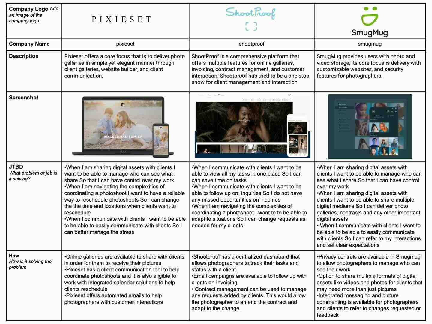
Competitive Analysis
Photoflow's competitive research focused on three primary platforms: Pixieset, ShootProof, and SmugMug. These platforms offer solutions for photographers, addressing various aspects of their workflow and business management.
Pixieset provides photographers with tools for online galleries, client management, and print sales.
ShootProof offers features for gallery management, client communication, and sales, with a strong emphasis on customization and branding.
SmugMug is known for its comprehensive suite of features, including website building, gallery hosting, and e-commerce capabilities.
Based on the competitor research, some key areas identified to include in the Photoflow app were:
Focus on usability and prioritize user-friendly interfaces with intuitive navigation to simplify the coordination process for photographers.
Implement robust security measures to protect photographers' digital assets and sensitive information.
HMW (How Might We) Statements
The “How Might We" statements were essential in identifying key opportunities for enhancing the Photoflow app, and addressing core challenges faced by photographers when working with clients. These statements were crafted to inspire innovative solutions and guide our ideation process by framing complex challenges into actionable problem areas. For instance, we explored ways to enable photographers to follow up with clients seamlessly, coordinate more effectively, and deliver photography galleries efficiently. We also focused on helping photographers set clear expectations with their clients to foster better communication and satisfaction. These statements not only drove our design decisions but also ensured that our solutions were firmly aligned with user needs throughout the project.
HMW Statements
How might we enable photographers to follow up with clients?
How might we help photographers coordinate with clients?
How might we empower photographers to deliver photography galleries to clients?
How might we help photographers set expectations with clients?
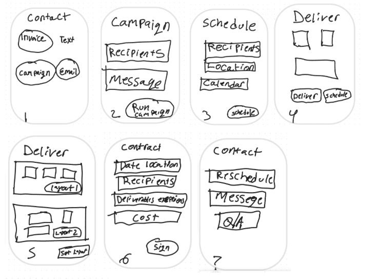
Sketches/Brainstorm
During the ideation phase, I explored a wide range of ideas inspired by user problems and "How Might We" statements, allowing me to try various solutions. One key idea was a contact area integrated with a scheduling feature within the Photoflow app, enabling photographers to easily follow up with clients and coordinate with team members. Another idea focused on automated scheduling features to streamline the process of setting up photoshoots and managing appointments. These sketches provided a starting point for further iteration and development, guiding the design process towards addressing specific challenges faced by photographers in managing their workflow and client interactions.
User Stories
User stories were instrumental in prioritizing and organizing user needs, ensuring that essential features were addressed. By categorizing stories into high, medium, and low priorities, functionalities were prioritized in the design.
As a user, I want to be able to message clients so that I can follow up with clients.
As a user, I want to easily schedule and reschedule photoshoots with clients, so that I can manage my bookings
As a user, I want to create and update a portfolio of my work within the system so that potential clients can easily view my style and quality.
As a user, I want to be able to send an invoice so that I can receive payment
As a user, I want to create personalized, secure online galleries for each client, so that I can deliver their photos in a professional environment
Site Map
The site map was created to visualize the structure and navigation of the website. By mapping out the hierarchy of pages and their interconnections, it helped establish a logical flow for users to navigate through the website seamlessly. This process began at the highest level with the creation of the login page. Following the initial section, the site map outlined five main areas: Home, Contact, Portfolio, Bookings, and Project Management. The site map played a crucial role in developing the information architecture by providing a clear overview of the website's structure, focusing on these five core areas. Further exploration delved into sub-areas within each main section. For instance, for the Home page, it was decided that the subcategory would include dashboards displaying items such as messages, tasks, and upcoming photoshoots. By identifying key pages, their relationships, and the pathways users would take to access them, the site map ensured that the website layout was user-friendly and easy to understand.

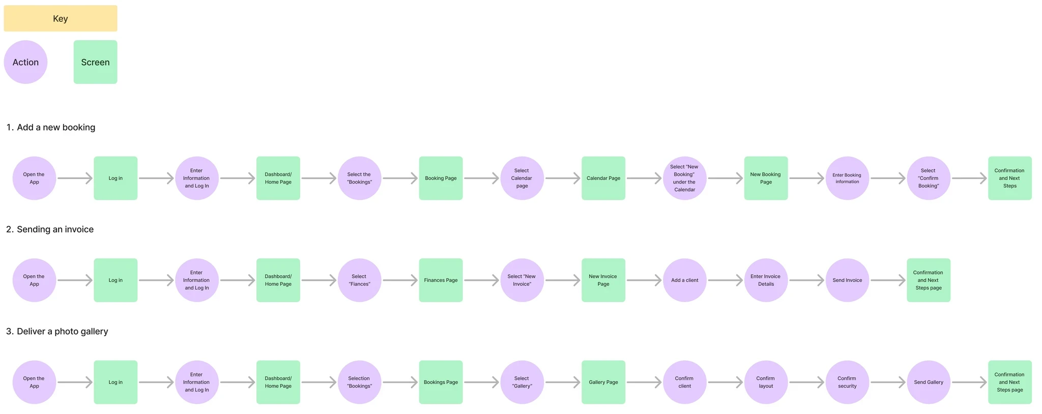
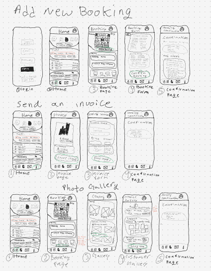
User Flows
These user flows were chosen based on their significance in addressing core functionalities essential to solving user needs. Each flow represents a critical action users are expected to perform to achieve specific objectives within the app. For instance, adding a new booking streamlines the process of scheduling appointments, which is fundamental to the app's purpose. Similarly, sending an invoice and delivering a photo gallery are crucial tasks for photographers to manage their finances and deliver their work professionally to clients.
Sketches
Sketches played a pivotal role in exploring diverse visual concepts and rapidly iterating on design ideas. Through sketching, I gained insights into layout refinements and experimented with various UI elements to enhance the user experience in booking, invoicing, and gallery delivery. I primarily learned how to create visually appealing graphs and reports, considering the various types available. Initially uncertain about which to use, sketching helped me visualize different options for each page. For instance, when designing the invoice page, determining the most suitable chart to display revenue trends posed a challenge. Sketching allowed me to explore multiple chart options, allowing me to identify the strengths and weaknesses of different design approaches.
Lo-Fi Wireframes
The Lo-Fi wireframes were instrumental in defining the structure and functionality of the Photoflow app, serving as the foundation for establishing a cohesive and intuitive user experience. I created wireframes for key workflows, including invoicing, booking, and gallery delivery—core processes essential to the app’s MVP. This phase allowed me to experiment with layout, content placement, and visual hierarchy.
One of the challenges I faced was achieving consistency across pages, especially since each workflow focused on different functionalities. To overcome this, I identified similarities between these processes and standardized the design elements, such as using consistent icons, button styles, and gallery components. I paid particular attention to spacing, experimenting with padding intervals of 8px, 16px, 24px, and 36px to create visual separation without disrupting the overall harmony of the layout.

Moodboard
The mood board served as a guide, directing the overall aesthetic and tone of the app. It drew inspiration from neutral brown, blue, and green tones, reflecting the professional yet approachable nature of the photography community. The inclusion of nature and office imagery showcases the different energies and creativity found in photography, ranging from calm office spaces to beach or mountain scenes. The imagery selected for the mood board heavily influenced design decisions, shaping the choice of colors, fonts, and graphical elements throughout the app.

Style Guide
The style guide for Photoflow was developed to ensure a consistent identity throughout the app. The process began by drawing inspiration from the mood board, which reflected the professional yet approachable nature of the photography community. Hues such as the different tones of blues were incorporated to evoke feelings of creativity and passion. These colors were chosen for their ability to create a calming yet engaging environment, aligning with the preferences of photographers.
The typography was selected to enhance readability and maintain a minimalist aesthetic. Fonts such as Roboto, in various weights and sizes, were used to create a clear hierarchy and ensure that text was easy to read without overwhelming the user. Clean lines and minimal text further contributed to a sense of professionalism and efficiency.
Minimalist design elements were also heavily influenced by the mood board, ensuring a clean and intuitive user interface. The style guide served as a foundational tool, guiding all design decisions and ensuring consistency across the app.

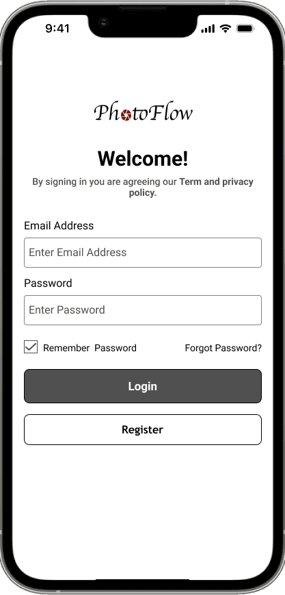
High-Fidelity Screens
Unlike wireframes, which focus on layout and functionality, hi-fi screens were created to present a more refined visual representation of the end product. Elements from the mood board and style guide significantly influenced the development of the hi-fi screens. The color schemes, typography choices, and overall design elements outlined in the style guide were foundational for crafting high-fidelity visuals. Similarly, the mood board provided inspiration and guidance, ensuring that the hi-fi screens aligned with the product's intended look and feel.
As the hi-fi screens progressed from wireframes to high-fidelity screens, several refinements and adjustments were made based on feedback such as visual hierarchy through text and spacing which was iterated multiple times to evoke a consistent and professional look and feel compared to the wireframes.
Prototype
Photoflow was created through Figma to provide a realistic simulation of user interaction with the product, it served as a tool for testing and refining the user experience. Through prototyping, I gained valuable insights into how users interacted with the interface, allowing for iterative improvements to enhance usability and functionality. Furthermore, when presenting Figma, allowed me to present Photoflow in a device where I chose the iPhone 14 to convey a real-life scenario. Overall, prototyping proved to be a crucial stage in the design process, allowing hands-on testing and iteration to ensure a refined and user-friendly final product.
Testing
The purpose of usability testing for Photoflow was to identify any usability challenges that may hinder users from seamlessly navigating the platform, as well as to gain insights into potential areas for improvement in the user experience. To achieve this, moderated usability testing was conducted with five participants who were recruited through social media outreach with Instagram. The testing process was remote where participants were asked to complete three key tasks: scheduling a photoshoot, sending an invoice after a photoshoot, and sending the final photo gallery to a customer.
Tasks/Scenarios
Please use the app to schedule the photoshoot.
Use the app to send the invoice to the customer.
Use the app to send the final gallery to your customer.
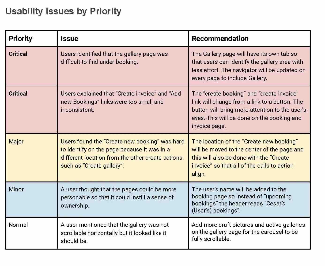
The redesign section demonstrates the key changes made based on usability testing findings, including making the gallery page easier to access, enhancing the visibility of the "Create Invoice" link, and repositioning the "Create New Booking" button for better user navigation.
Issue 1
Based on the findings from the usability testing, users found the gallery page difficult to locate under the "Bookings" section. To address this issue, the gallery tab was moved to the main navigation bar for easy access and removed from the booking page. This change ensures users can quickly and easily find the gallery feature.

Issue 2
From the usability testing, it was identified that the "Create Invoice" link was small and placed on the bottom right side, making it hard to notice. To address this issue, the link was changed to a more noticeable button and repositioned to grab the user's attention. This enhancement improves visibility and ensures that users can easily find and use the "Create Invoice" function.

Issue 3
Usability testing revealed that users found the "Create New Booking" link hard to identify due to its different location from other create actions like "Create Gallery." To address this, the "Create New Booking" link was moved to the center of the page. This change improves consistency and ensures that users can easily locate and use the "Create New Booking" function.

Reflection
Overview
Working on Photoflow allowed me to immerse myself in the unique challenges faced by photography businesses, directly influencing my design approach. I particularly enjoyed working on essential workflows like invoicing, booking, and gallery delivery, as these were critical areas that would ultimately streamline photographers' day-to-day operations. Developing a design system that catered specifically to the needs of photographers was one of the most rewarding aspects of this project. My goal was to create an interface that felt intuitive and seamless, allowing users to focus solely on their business processes without needing technical knowledge of the product.
The biggest challenge was defining a cohesive design system that truly resonated with the target audience. This involved carefully selecting elements like fonts, button styles, spacing, and even the language used throughout the application. I aimed to create a calming and welcoming experience, using colors like blue to instill a sense of ease and fonts that were clear and stress-free on the eyes. It was crucial that every element felt purpose-driven, enhancing the user journey without adding unnecessary complexity.
What I found most impactful was how seemingly minor adjustments, such as button placement or text alignment, significantly improved the overall user experience. Usability testing and iterative design played a vital role in refining these details, and I was able to see firsthand how our design decisions met the needs of the photographers using the app.
The transformation from initial wireframes to high-fidelity screens was particularly fulfilling, as each iteration brought the product closer to its final vision. User feedback was invaluable, highlighting areas for improvement and validating the decisions made. I believe that the design system we developed will resonate well with clients, as it emphasizes usability, accessibility, and a clear path to achieving their business goals. My experience as a photographer allowed me to empathize deeply with the end users, though I made a conscious effort to design based on research and data rather than personal biases.
Ultimately, this project reinforced the significance of thoughtful, well-organized design systems tailored specifically to the needs of the target audience. I am confident that Photoflow’s design will effectively support photographers by providing an intuitive, user-friendly platform that helps streamline their workflows.