Best In Health

Best In Health

Best In Health

A B2B and B2C Website focusing on creating wellness programs for both individuals and corporations.

Overview

Overview

Best in Health, founded by Celeste Harrington, empowers busy professionals with personalized health coaching and memberships for fitness, habit tracking, and nutrition. To enhance the digital presence, I collaborated on redesigning both the B2B and B2C websites to improve user experience and drive conversions. The main challenge was ensuring a cohesive user experience across mobile, tablet, and desktop versions. Additionally, I conducted Quality Assurance (QA) testing to ensure a seamless delivery. This project culminated in the successful launch of the revamped site, showcasing a stronger digital presence for the brand.

My Role
My Role

UX/UI Designer

Tools
Tools

Figma, Google Docs, Slack, Zoom, Monday.com, Chat GPT, Loom

Process
Process

Discover, Sprint 1, Sprint 2, Reflection

The Problem

The Problem

Best in Health faced significant usability challenges across their B2B and B2C websites, particularly on mobile and tablet interfaces. The company’s existing designs were inconsistent and did not feel intuitive, especially for busy professionals and corporations seeking accessible health and wellness solutions. These issues led to decreased user engagement, and dissatisfaction, and hindered the company’s mission of delivering robust wellness programs.

Our Solution

Our Solution

Our team delivered a cohesive redesign focusing on responsive design principles and incorporating local text variables for enhanced font consistency. We implemented streamlined navigation and optimized layouts for tablet and mobile interfaces. Additionally, we collaborated extensively with developers and conducted rigorous QA testing to ensure a successful website launch. This solution was applied to both the B2B side and the B2C website, resulting in an improved user experience with intuitive navigation and a consistent look and feel across all platforms.

Discovery

Discovery

Discovery

Kickoff

Kickoff

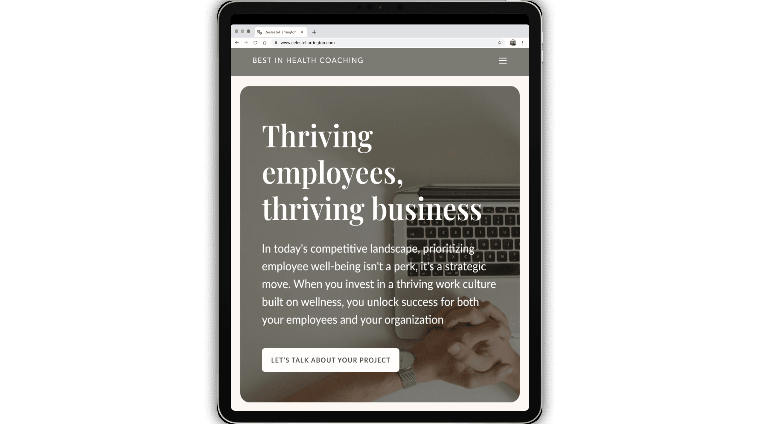
Best in Health’s goal was to enhance the usability and overall design of their B2B and B2C websites. The client’s primary ask was to create a responsive and cohesive experience across mobile, tablet, and desktop interfaces to better serve busy professionals and corporations seeking wellness solutions. To inform our redesign, the client provided access to existing wireframes, analytics data highlighting user pain points, and a style guide that outlined their current branding elements. Our team used these materials as a foundation to identify design inconsistencies and gaps in user flow, guiding our approach to deliver a more intuitive and engaging platform.

Sprint Context

Sprint Context

With our objectives set, we divided the Best in Health project into three distinct sprints, broken down into Research, Ideation, Design, and Iteration processes. My responsibilities were focused on enhancing specific sections to improve responsiveness and consistency across devices.


Sprint 1: Mobile and Tablet Redesign (Layout Optimization)

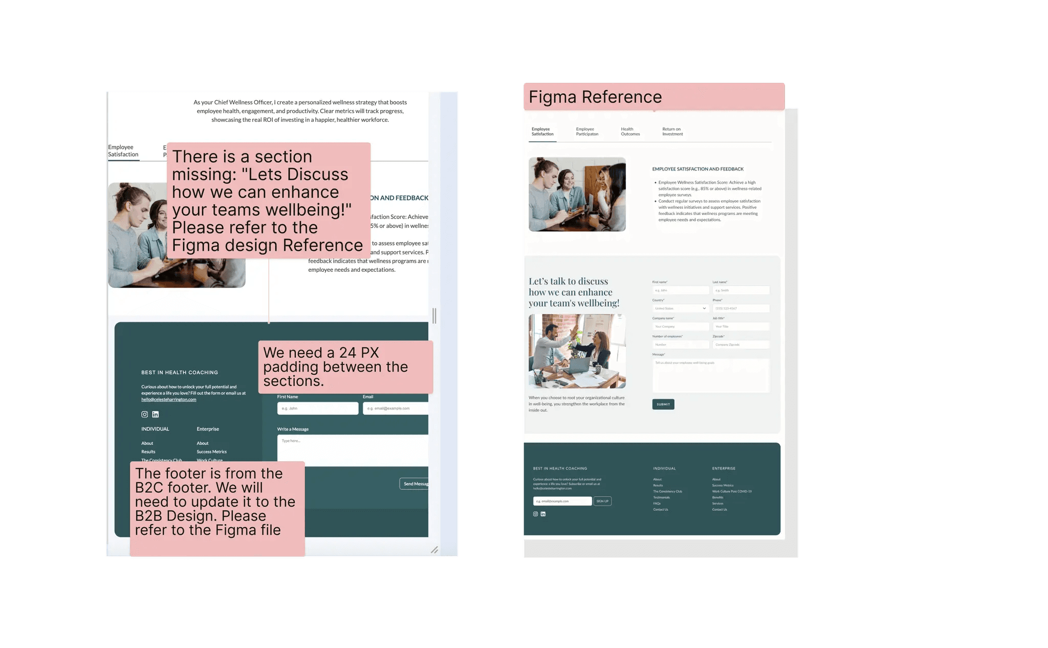
Sprint 2: QA and Client/Developer Handoff (Design Review and Annotation)

Sprint 1 - Responsive Design

Sprint 1 - Responsive Design

Sprint 1 - Responsive Design

Research

Research

In Sprint 1, our research focused on enhancing responsive design by analyzing the existing B2B and B2C websites' look and feel, and comparing them to competitors and industry leaders. We specifically examined design patterns and their adaptation across devices, strongly emphasizing mobile and tablet interfaces. Our research included annotating multiple websites to pinpoint key design trends and industry standards and identifying critical areas for improvement, such as layout optimization and intuitive navigation.


Top Takeaways from Analysis


Displaying Data in Containers
  • Inspired by elements in Loom.com, we found that displaying data in containers allowed each data point to be visible with supporting details, giving the information space to breathe while relaying it to the reader.

Focus on Responsive Web Design
  • Mobile and app designs differ significantly from responsive web designs, especially in navigation placement. For example, unlike apps where navigation is often at the footer, responsive designs typically use a navigation icon for mobile and tablet interfaces.

Visual Hierarchy for Core Call to Action
  • Drawing inspiration from Nike’s NRC app and Promix Nutrition, we emphasized establishing a solid visual hierarchy around core calls to action, such as the hero image’s "Start Your 7 Day Free Trial" prompts, to drive user engagement. 

In Sprint 1, our research focused on enhancing responsive design by analyzing the existing B2B and B2C websites' look and feel, and comparing them to competitors and industry leaders. We specifically examined design patterns and their adaptation across devices, strongly emphasizing mobile and tablet interfaces. Our research included annotating multiple websites to pinpoint key design trends and industry standards and identifying critical areas for improvement, such as layout optimization and intuitive navigation.


Top Takeaways from Analysis
Displaying Data in Containers
  • Inspired by elements in Loom.com, we found that displaying data in containers allowed each data point to be visible with supporting details, giving the information space to breathe while relaying it to the reader.

Focus on Responsive Web Design
  • Mobile and app designs differ significantly from responsive web designs, especially in navigation placement. For example, unlike apps where navigation is often at the footer, responsive designs typically use a navigation icon for mobile and tablet interfaces.

Visual Hierarchy for Core Call to Action
  • Drawing inspiration from Nike’s NRC app and Promix Nutrition, we emphasized establishing a solid visual hierarchy around core calls to action, such as the hero image’s "Start Your 7 Day Free Trial" prompts, to drive user engagement. 

Ideation

Ideation

During the ideation phase, we brainstormed design ideas for mobile and tablet screens, focusing on consistent spacing and visual hierarchy. We created low-fidelity wireframes to visualize the layout and functionality, which were then reviewed by a senior designer. A key challenge was balancing spacing and text hierarchy across devices. To overcome this, we ensured the hierarchies were distinct yet consistent with the desktop version, preserving usability. These refined concepts led to the development of high-fidelity screens that effectively addressed the need for consistency across all platforms.

High-Fidelity Wireframes

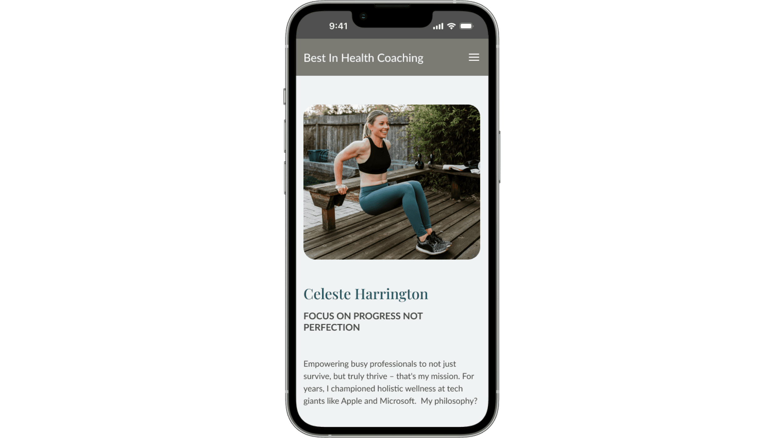
During Sprint 1, we developed high-fidelity wireframes for both the B2B and B2C sections, each containing ten key areas. I was responsible for designing five sections in both B2B and B2C, focusing on ensuring consistency across tablet and mobile interfaces while enhancing user experience.
My Role in Designing the Hi-Fis
Navigation Enhancements
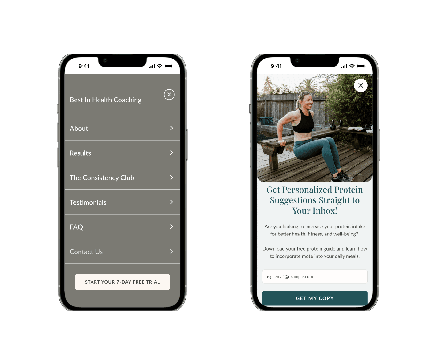
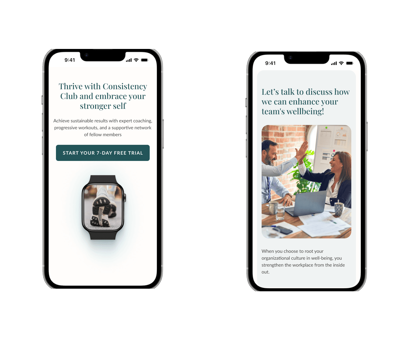
  • For the mobile and tablet navigation, I maintained consistency in design but identified an opportunity to improve user engagement by adding an extra CTA button. This adjustment aimed to provide a clear and accessible sign-up option, enhancing the overall conversion rate and creating a smoother user journey.


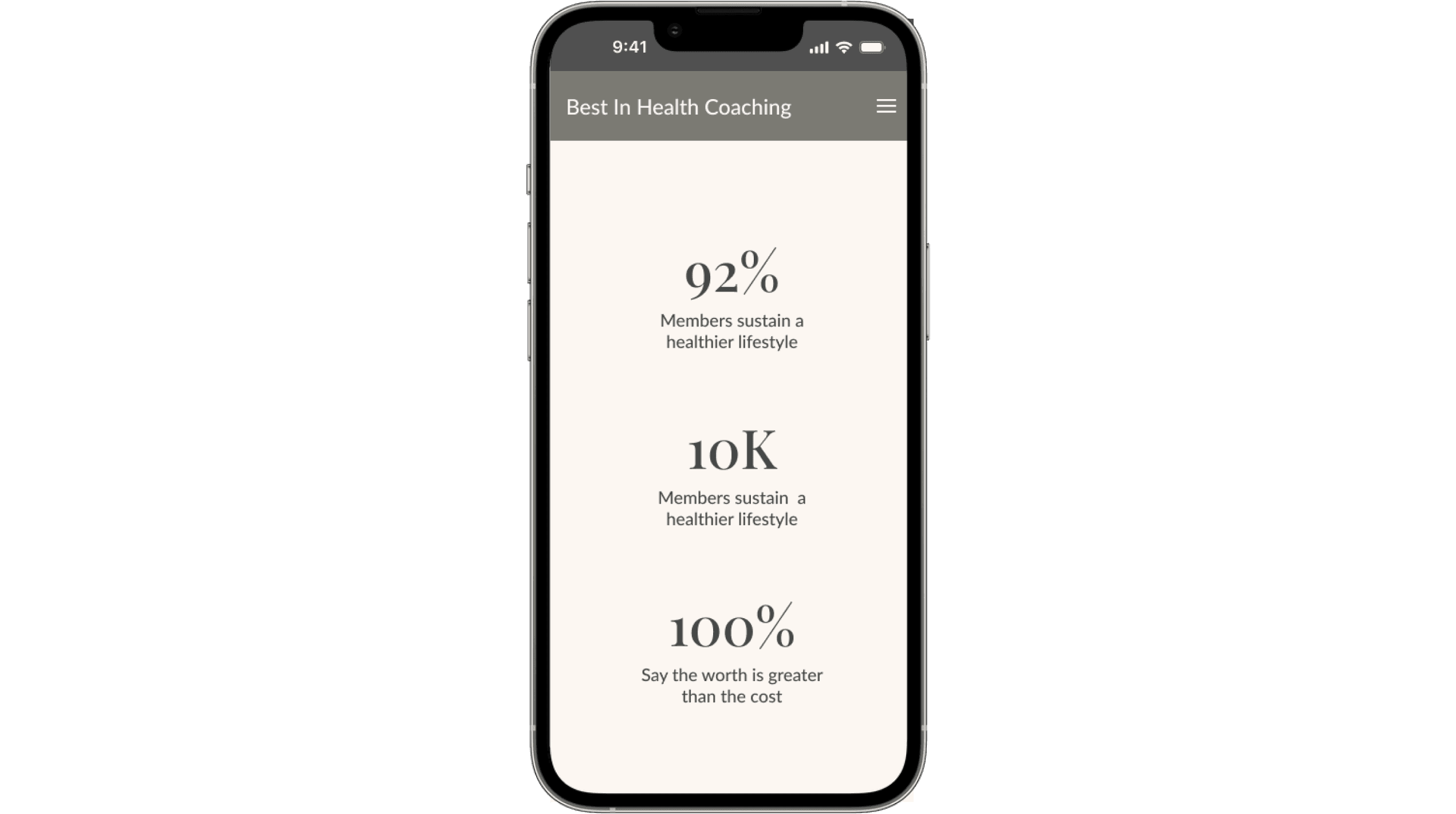
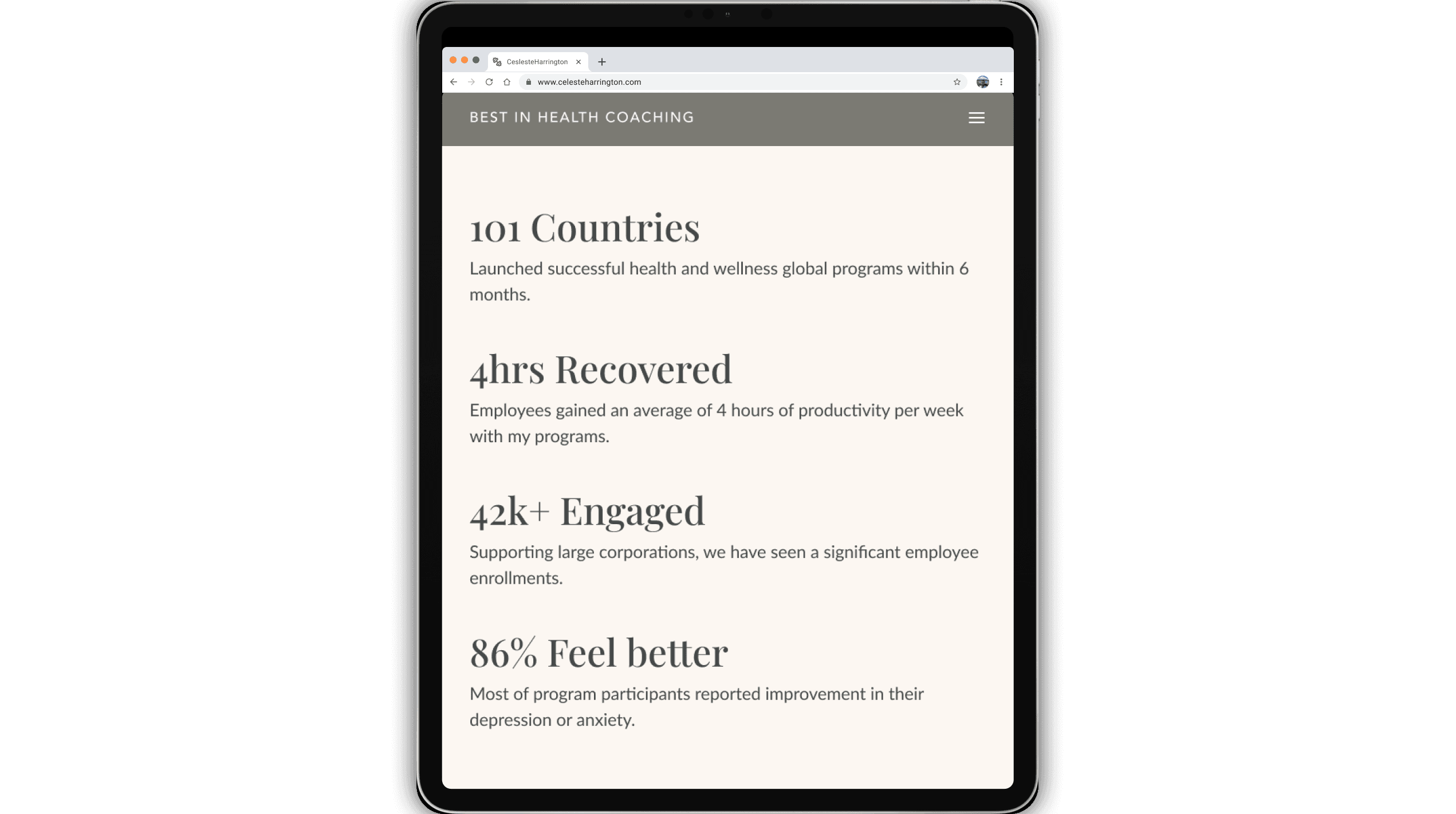
Facts Section Design
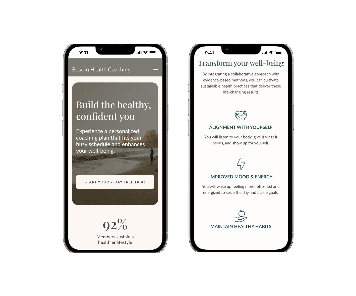
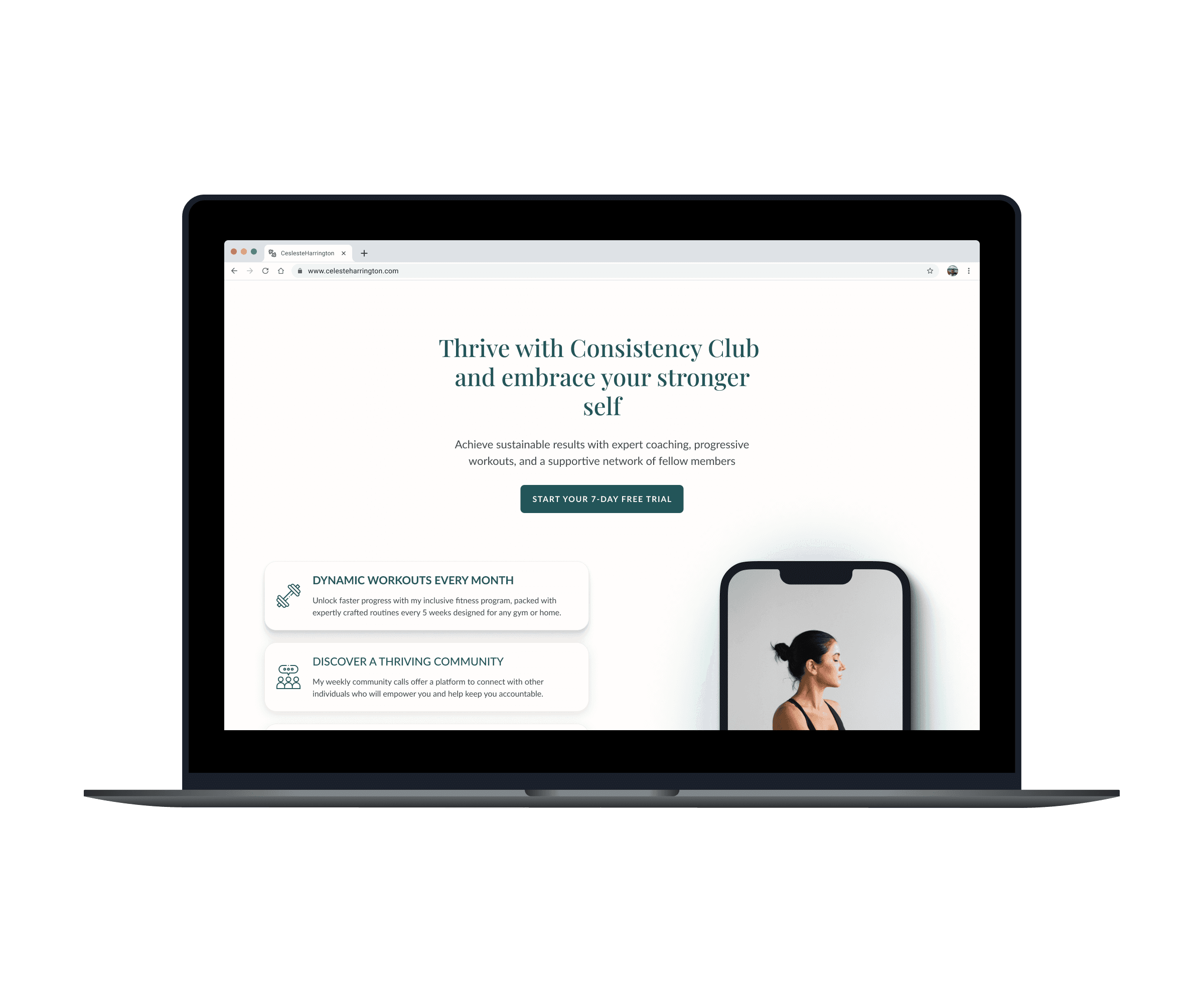
  • I designed the facts sections for both the B2B and B2C areas, emphasizing the presentation of key data points in containers. This approach allowed important information to stand out while still providing supporting details in a visually appealing and readable format. The structured layout made the data easy to digest, catering to users who wanted a quick overview and those who needed more in-depth information.


Adjustments from Mid-Fi to Hi-Fi:
  • Positioning of Elements:** One significant change I made was moving the search bar to a more prominent position at the top of the screen in the B2C section, ensuring it was easily visible and accessible. This adjustment was based on feedback that highlighted the need for improved visibility of key navigation tools.

  • Consistent Spacing and Visual Hierarchy:** In transitioning from Mid-Fi to Hi-Fi, I focused on refining the spacing and visual hierarchy, ensuring that text sizes, buttons, and interactive elements were consistent across all devices. This helped create a cohesive look and feel, which was essential for a responsive design that adapted seamlessly to different screen sizes.

  • Enhancing CTA Visibility: The addition of CTA buttons in key sections was also refined during the Hi-Fi stage. I increased their size slightly and adjusted the color contrast to make them more visually prominent, driving user actions without overwhelming the design.

Iteration

Iteration

During the iteration phase, I refined our tablet and mobile designs based on feedback and guidance from the senior designer. The goal was to ensure seamless transitions between the three screen sizes (desktop, tablet, and mobile), enhancing the overall user experience across all devices. 


Example for Navigation Revisions

Initially, I designed the navigation based on inspiration from competitor samples. After the first round of feedback, I made significant adjustments to the spacing and sizing to ensure a balanced and user-friendly layout. One critical change was adding an "X" exit button to the navigation, allowing users to close the menu easily, which improved the flow and usability.


Final Touches and Design Enhancements

In the final revision, I added bolder separation lines to distinguish different sections within the navigation, ensuring clear differentiation of content. The "X" button was also refined to align with the overall design system, enhancing the visual consistency.


How These Adjustments Served the Client/User

The navigation changes improved the user journey by making navigation more accessible and intuitive, directly addressing user feedback on usability.

  • Spacing adjustments created a visually pleasing layout that guided the user's eye effectively, enhancing the overall engagement with the content.

  • Consistency in design elements helped unify the B2B and B2C experiences while respecting their unique needs, leading to a polished final product that met client expectations.


These iterative improvements were essential in refining our designs, ensuring that every detail contributed to a fast, accurate, and successful website launch with a polished and user-friendly experience.

During the iteration phase, I refined our tablet and mobile designs based on feedback and guidance from the senior designer. The goal was to ensure seamless transitions between the three screen sizes (desktop, tablet, and mobile), enhancing the overall user experience across all devices. 


Example for Navigation Revisions
Initially, I designed the navigation based on inspiration from competitor samples. After the first round of feedback, I made significant adjustments to the spacing and sizing to ensure a balanced and user-friendly layout. One critical change was adding an "X" exit button to the navigation, allowing users to close the menu easily, which improved the flow and usability.


Final Touches and Design Enhancements

In the final revision, I added bolder separation lines to distinguish different sections within the navigation, ensuring clear differentiation of content. The "X" button was also refined to align with the overall design system, enhancing the visual consistency.


How These Adjustments Served the Client/User

The navigation changes improved the user journey by making navigation more accessible and intuitive, directly addressing user feedback on usability.

  • Spacing adjustments created a visually pleasing layout that guided the user's eye effectively, enhancing the overall engagement with the content.

  • Consistency in design elements helped unify the B2B and B2C experiences while respecting their unique needs, leading to a polished final product that met client expectations.


These iterative improvements were essential in refining our designs, ensuring that every detail contributed to a fast, accurate, and successful website launch with a polished and user-friendly experience.

Sprint 2 - QA Testing & Handoff

Sprint 2 - QA Testing & Handoff

Sprint 2 - QA Testing & Handoff

Dev Handoff

Before starting QA, we ensured a smooth transition to development by thoroughly reviewing and annotating our Figma designs. I contributed by checking that all design elements were clearly labeled and easy for developers to interpret. We held multiple review sessions to confirm that our designs were well-informed and consistent across devices. This preparation minimized confusion during development. Once development began, I tracked bugs via monday.com, documented issues with detailed "where" and "what" statements, and collaborated closely with developers to address any discrepancies between the designs and the live site, ensuring a successful handoff.

QA

During the QA process, I actively used Figma to reference the design, tracked bugs with monday.com, and verified fixes in a staging environment. I documented bugs with clear descriptions and attached screenshots, enabling developers to quickly understand and address issues. This structured approach streamlined our workflow, ensuring that all bugs were properly tracked and resolved.


One of the significant challenges we faced was adapting certain design elements like containers, carousels, and fonts due to system limitations. To address these, I worked closely with other designers, making necessary compromises while preserving our design vision. For example, we adjusted the carousel's design to fit within the system constraints, ensuring it remained functional while staying true to the intended user experience. Clear communication with developers, supported by visual aids and detailed explanations, was crucial in overcoming these challenges.


Despite some compromises, I am satisfied with the final result, as it aligns well with our original design goals. This experience emphasized the importance of flexibility and effective communication in a collaborative environment. Moving forward, I would prioritize more thorough initial discussions with developers to anticipate technical constraints and incorporate frequent check-ins to catch potential issues early, ensuring smoother project execution.

Reflection

Reflection

Reflection

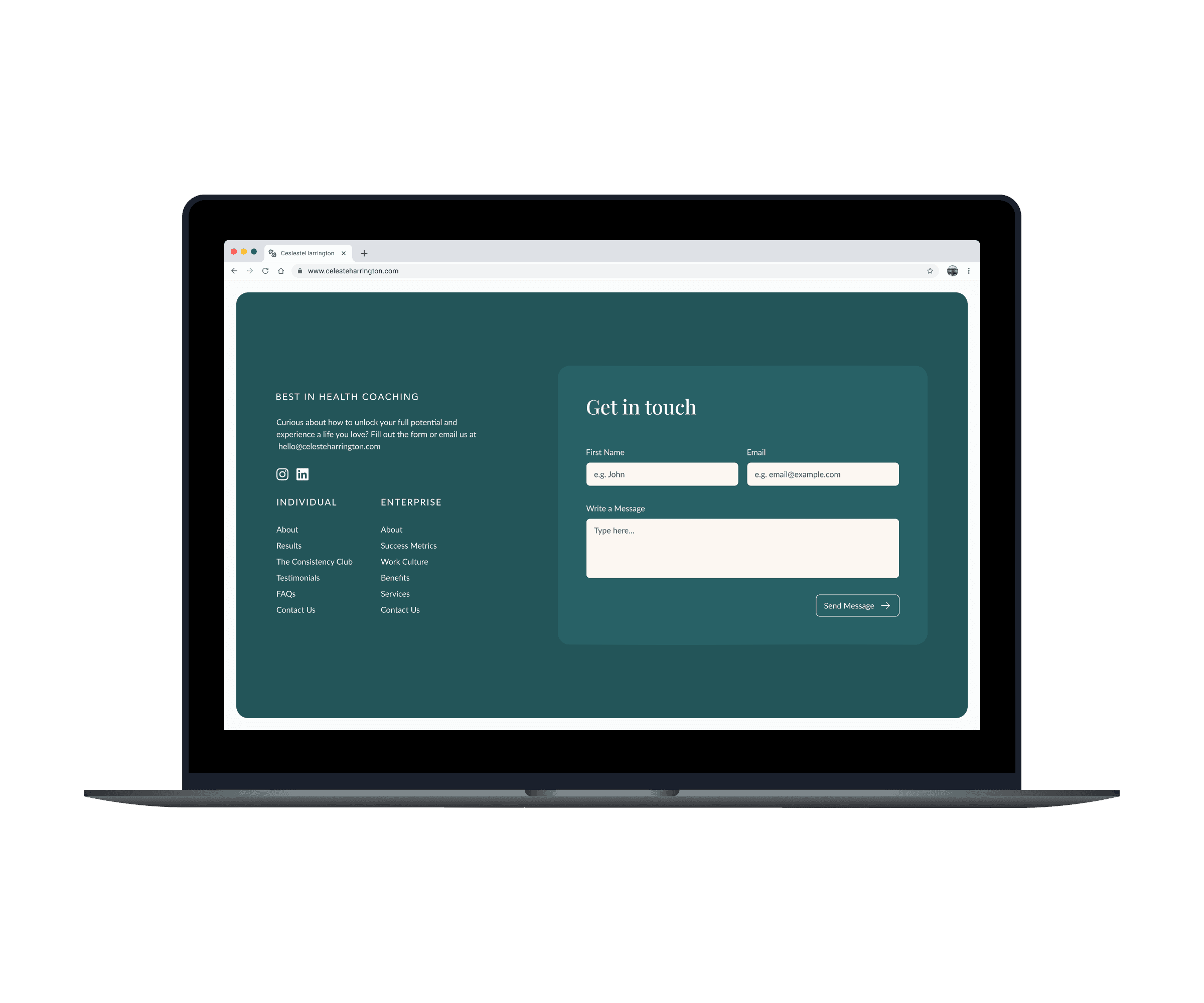
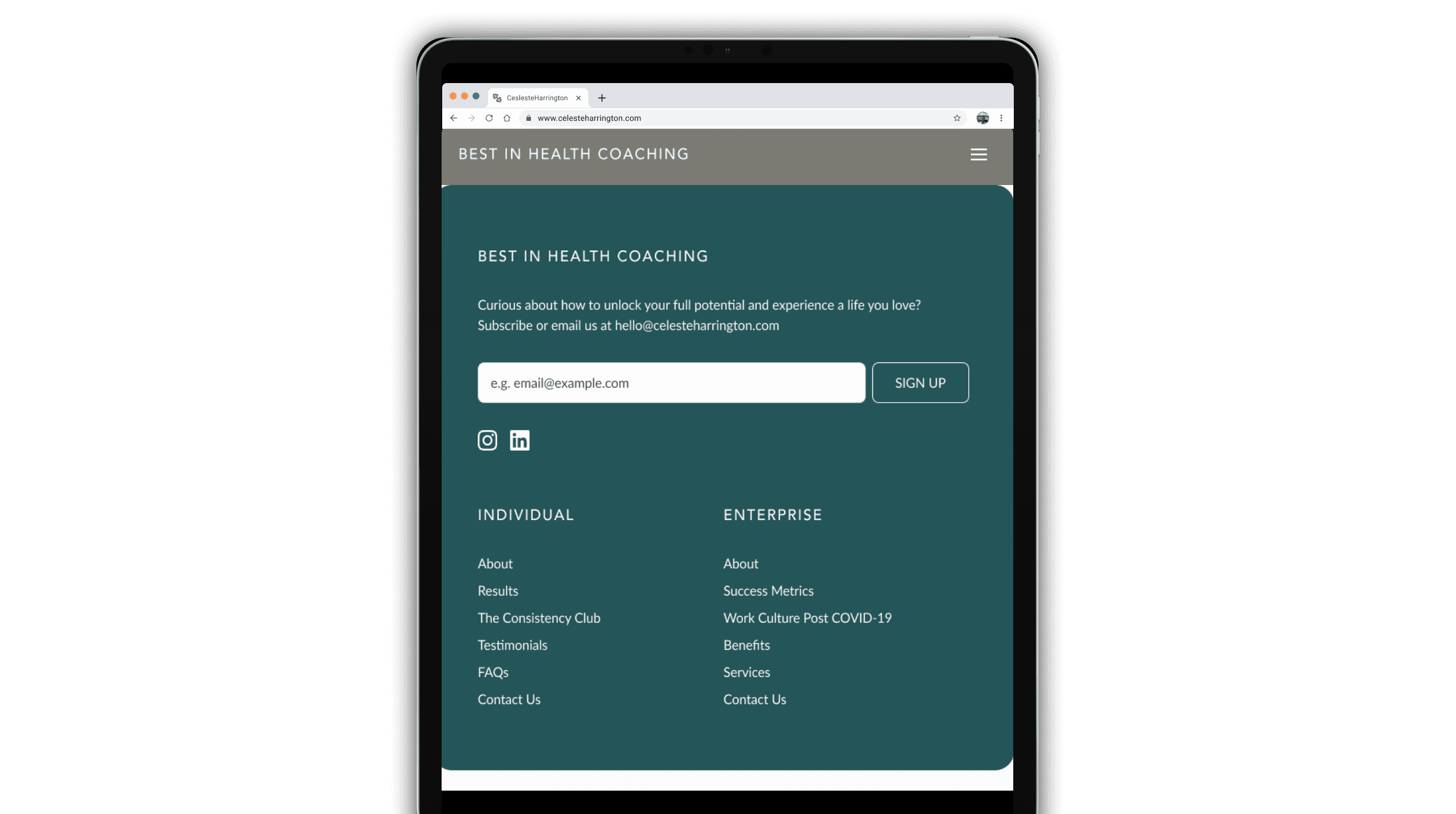
Reflecting on this project, I found the experience both challenging and rewarding, particularly in the sections I owned, such as the navigation, facts section, footer, “multiple benefits of the Best in Health” section, and the Work in Culture section. I enjoyed the complexity of working across B2B and B2C segments, each with distinct goals and needs. My favorite part was designing the footers because it required balancing personalization and consistency; the B2B footer aimed to capture newsletter subscriptions, while the B2C footer focused on lead generation through a form. 

What went particularly well with the overall project was our ability to pivot when necessary. Originally, we were designing each screen from scratch, but after discussing it with the senior designer, we streamlined our approach by leveraging initial desktop elements as a basis for tablet and mobile screens. This not only saved time but also allowed us to maintain visual consistency across all devices.


Given more time or resources, I would further refine the B2B and B2C components by dedicating specific teams to each or assigning screen sizes to individual designers to ensure an even more tailored and focused approach. Additionally, expanding on areas like adding more prominent CTAs or enhancing certain elements like the benefits sections would provide additional value, driving better results in terms of user engagement and conversion rates.

Overall, this project solidified my understanding of balancing creativity with strategic decision-making and the importance of adaptability in the design process. Moving forward, I plan to implement more thorough initial planning and developer check-ins to better anticipate constraints and streamline execution.